overview

The B.C. Ministry of Health is collaborating with the Ministry of Education, the Ministry of Mental Health and Addictions and the Provincial Health Office to improve resources and outcomes related to youth substance use. The initiative promotes evidence-based approaches to youth substance-use education in BC schools. By mobilizing knowledge from educational and health communities, the project will ensure consistent, credible and effective resources are readily available to anyone supporting older elementary school students and high school students (grades 4 to 12). The project aims to prevent, delay and reduce substance-related harms through the promotion of youth autonomy, belonging and competencies. As part of this work, the Ministry needed a name and brand for this initiative that was approachable and friendly, yet credible and trustworthy.

hand holding a cell phone showing a recommended resource

key opportunities

This project presented a number of challenges and opportunities, which we were excited to tackle.

welcoming words

Stigma around substance use is one of the biggest barriers for people seeking and receiving support. For this work we knew we had to actively disrupt many of the stereotypes that perpetuate the shame related to addiction and substance use, choosing the most-up-todate and appropriate words and phrases in everything we created.

facilitating consensus

In developing a brand for the project, we needed to build consensus around shared goals and priorities. Our approach navigated diverse viewpoints, without compromising the non-negotiables of the name and brand.

standing out

There are countless programs and services that educate people about youth substance use. Many are contradictory and some are even more harmful than helpful. We needed to differentiate ourselves while emphasizing our unique position as a trusted, evidence-based, government-sponsored initiative.

building credibility

We know that credibility is tricky to build and easy to lose. More than simply a name, tagline, logo, or messaging, we needed to ensure the name and brand evoked feelings of trust, caring, knowledge and experience.

our approach

We took a multi-pronged approach to develop the name and brand for ABCs of Youth Substance Use. Supporting our partner Bunyaad Public Affairs, we ensured there was a clear understanding of project principles, target audiences, and overarching goals. We then worked closely with The Beacon Design Collective to bring the new brand to life.


thorough competitive analysis

For this initiative, differentiation was key. We started by reviewing the most well-known organizations or youth substance-use programs. We completed a full environmental scan, including a deep dive to better understand gaps and opportunities.

objectivity in the naming process

We led a series of team meetings that generated possible directions or “anchor points” for the new name. From there our team carried out additional brainstorming and ideation, fleshing out our best ideas for consideration. We then led a workshop where our project partners used our name evaluation matrix to score the preferred name, confirming the strengths and weaknesses of the name based on ten branding criteria, as well as the values and principles of the project. The name ABCs of Youth Substance Use was ratified.

setting our designer up for success

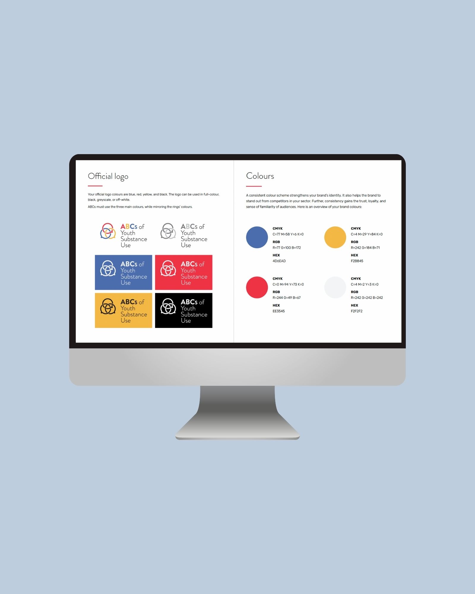
With our name confirmed, we began work on a fulsome visual identity. We developed a comprehensive design brief, outlining the goals of the project and its detailed target audiences, including their motivators, stressors, needs and expectations. We also translated the project’s values into design considerations, helping our designer understand how to reflect the project’s complex principles into its visual aesthetic. We shared three concepts with our team, helped them understand the rationale of the design choices behind each one, and supporting them to choose one concept to refine further. After facilitating feedback across the project team and with our designer, we worked with our designer to produce a comprehensive visual identity that included a full logo suite, branded assets, colour palette and typography.

metrics that matter

We produced a full suite of brand assets for this project that were put to good use, right away.

0

logo files

0

branded templates

0

competitors scanned

0

branded stamps

the results

Our approach and tactics led to the successful launch of the ABCs of Youth Substance Use initiative in British Columbia. By developing a unique, credible and compelling brand, the project was able to move forward in developing critical components of its outreach and knowledge mobilization strategy, including the creation of a Professional Learning (PLC) in the education sector, and a Community of Practice (COP) in the health sector. Once in play, the brand became the backdrop to a wide suite of communication materials and assets, including branded reports, an online project archive, and an e-digest that distributed tips, events and resources to subscribers.

a computer screen showing a brand manual