overview

For 40 years, the largest sexual violence support centre in BC had a name rooted in the rape crisis movement of the 1980s. WAVAW’s work was progressive and anti-oppressive and continually inclusive, but its name was equated with white, liberal feminism and harmful to harm to survivors who identify as BIPOC, 2SLGBTQI+ or as part of the sex-working community. After several years of deep and intentional work to align its values of feminism, anti-oppression, intersectionality and de-colonization into all aspects of its services, WAVAW was ready to adopt a new, more inclusive name.

Spur was retained to help WAVAW uncover a new name that better suited its reputation as an inclusive, de-colonizing sexual violence support centre, and to guide a comprehensive visual and organizational rebrand that operationalized this new name and identity. 

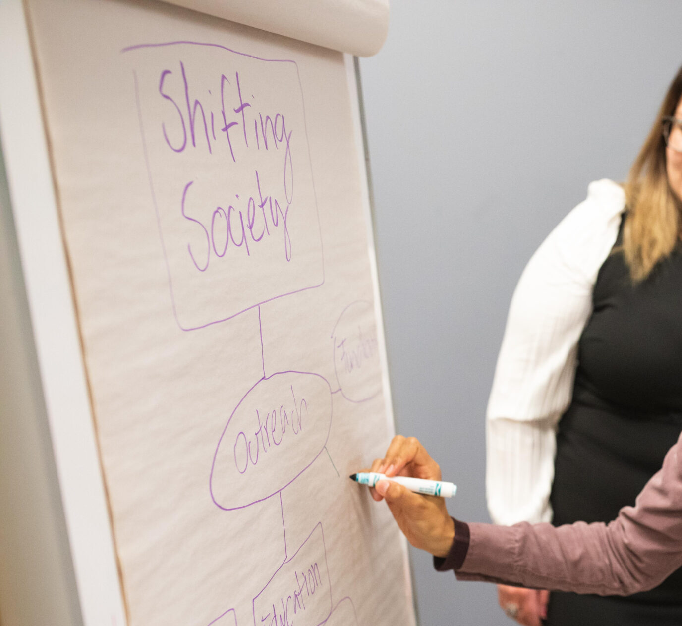
two women look at a oversized post-it paper as one writes the words 'shifting society'

key opportunities

This project was unique for several reasons. Here are just a few:

a decolonizing mindset

Our team was committed to matching our clients’ commitment to decolonizing approaches. We approached every space and conversation with cultural humility, stopping to interrogate whether a so-called best practice or recommended approach may have been rooted in colonial frameworks.

holding space for grief

As an organization rooted in empathy and trauma-informed practices, this team had a deep appreciation for how a rebrand might illuminate feelings of grief. From the beginning, we attempted to hold space for grief and grief-related responses, as people processed letting go of what they knew and learned to embrace something new.

supporting constructive conflict

This team was not one to shy away from strong opinions. We knew we had to have strong, well-understood agreements to guide the project from start to finish, so we could navigate tough conversations and sticking points.

specificity without exclusion

This organization rebranded to reflect the full diversity of the survivors they serve and the services they offer. When describing diverse lived and living experiences, oftentimes one word or a short phrase doesn’t feel sufficient. We had to find a name that could hold the organization’s full breadth and depth, knowing that we wouldn’t be able to please absolutely everyone in their wider community.

our approach

Every project needs a workplan. But in this case, we went a few steps further, creating a full project map that outlined what success would feel like for the project team. We defined who would be engaged and consulted on which questions, when, to ensure key decisions on the new name and visual identity included everyone in some way, without risk of catastrophic set-backs. 

We partnered with the brilliant Janice Callangan of NewNew Studios for the visual strategy and graphic design components of this work. Informed by our direction, support and feedback, Janice and her team developed the new Salal logo and visual identity.

comprehensive landscape analysis

For our landscape brand analysis, we looked not only at organizations in close proximity, but also those doing similar work on a national or international scale. We ensured our environmental scan included a wide swath of organizations, so no stone was left unturned before we identified strategic brand opportunities.

creativity backed by objective evaluation

We designed and facilitated creative exercises with the project team to brainstorm countless phrases related to what they do and why it matters. We never lose sight of the fact that the people who work inside an organization have the sharpest perspective – and we leveraged that. Informed by these ideas we generated dozens of names, which then created a shortlist to evaluate through our custom name evaluation matrix. This combination of creative and objective measurements helped equalize strong opinions and produce a clear winning name: Salal.

transparent and clear roll-out plans

We worked closely with design partner New New Studios to ensure logo concepts were presented and refined in ways that clearly articulated what design choices were being applied, and why. We also provided our client with a comprehensive brand inventory to document every possible instance of their old brand, prioritizing how they would roll-out the new brand, on what timeline

the results

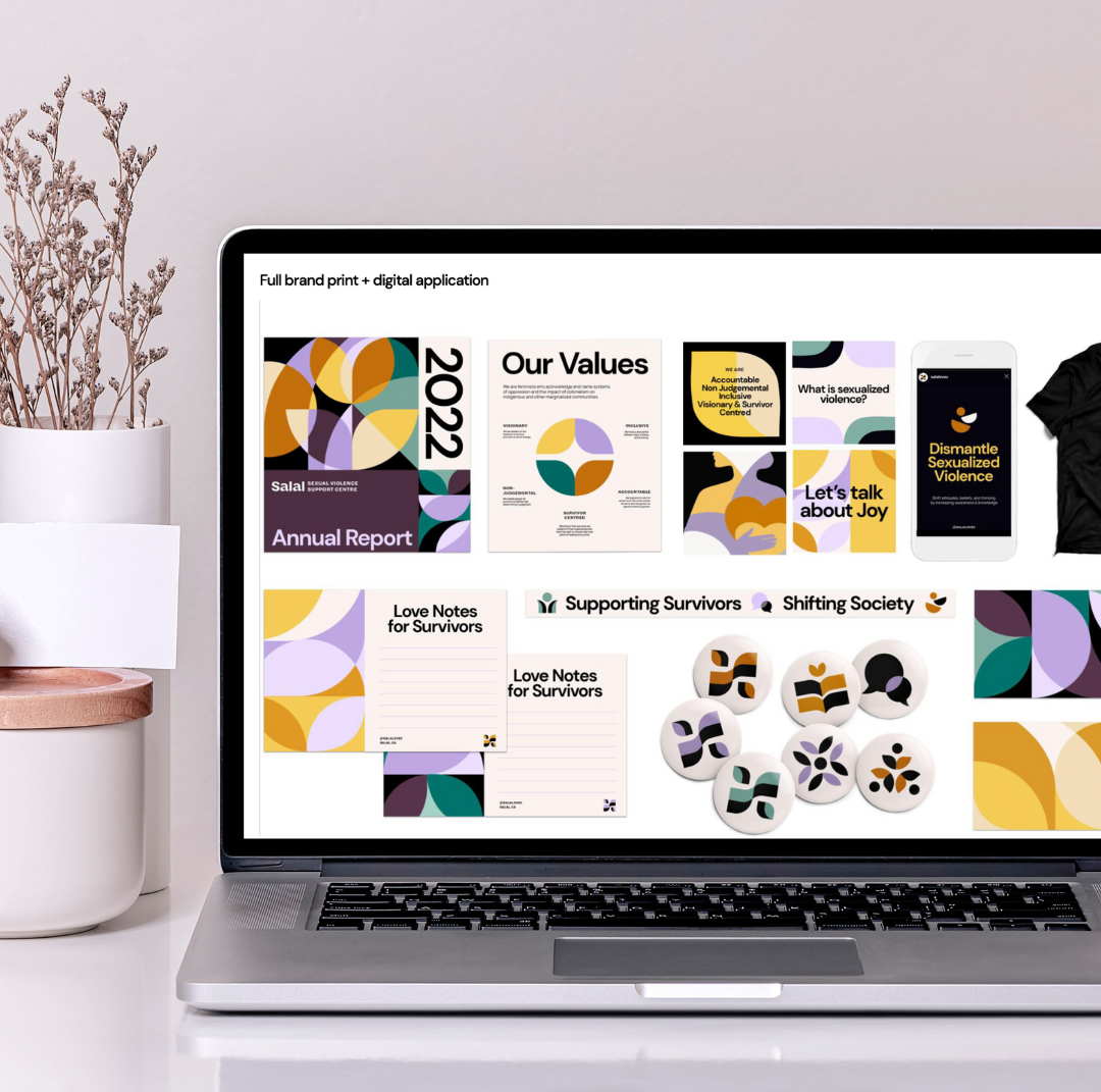
The transformation to Salal Sexual Violence Support Centre was an unequivocal success. By centering the organization’s key audiences in the new brand positioning strategy, and by providing a comprehensive roll-out plan with key messages and FAQs, we equipped Salal with everything they needed to re-introduce themselves to their dedicated community. The name Salal—a lush and resilient Pacific coast plant—resonated deeply with diverse supporters and survivors. And the visual identity from New New Studios was striking and powerful, a perfect complement to the organization’s new name.

a laptop showing examples of Salal's new brand

Working with Spur to do Salal’s rebrand was one of the highlights of my career. We knew going into this process that we would need to work with people that could align with our values, trust that we knew our constituents best, were able to be agile and follow our flow if we needed to slow things down or create space for ritual and change management; and they did just that. When a 40 year old organization chooses to rebrand it is no small feat; Spur and NewNew supported us, listened, took feedback humbly and integrated it and ultimately we have walked away with a beautiful new name and brand that feels so incredibly like “us”. We are so grateful for the process and for all of the guidance, wisdom, knowledge, and inspiration that our team was offered along this journey by the team at Spur. We’re thrilled to now be Salal Sexual Violence Support Centre.